

DesTools
A Chrome extension I designed and built for the last stretch of AI-assisted front-end work. It lets you refine a live interface the way you would in a design tool, then hands the changes to a coding agent as structured instructions.

Role
Product Design & Development
Team

Timeline
August 2026 — Now
Methods
Initial Brief
Coding agents get an interface most of the way there. The last stretch is visual work: a padding that feels tight, a heading that is one size too small, a card sitting too close to its neighbour. Describing those changes in words is slow, and precision gets lost on the way.
The goal was to make that stretch feel like design work again. Select an element on the running page, adjust it directly, and copy a change request the agent can apply to the source code. One constraint shaped everything else: nothing is installed in the project. No package, no SDK, no plugin.
- 1 Select Activate the extension on a tab and click any element on the page.
- 2 Adjust Edit its properties in the side panel, or drag directly on the page.
- 3 Hand over Copy the change request and paste it into your coding agent.
People Problem
People who care about the details of an interface know exactly what they want to change when they look at a built screen, but they have no direct way to say it. DevTools is made for debugging, so every tweak has to be remembered and typed out again for the agent. A design file is a picture of the interface, not the interface itself.
So the problem is one of translation: let people point at the real thing, and make sure that what they did arrives at the agent intact.
Ground Rules
Four rules hold the product together, and no feature is allowed to break them:
- Nothing to install. It works on any page you can open, with a local dev server as the main case.
- The page stays yours. Style edits live in one separate stylesheet, so turning the tool off leaves the page exactly as it was. A removed element is held, never destroyed.
- No standing access. No host permissions, no network requests, no accounts. The extension can only see a tab after you click its icon there.
- The panel never guesses. When a control has no visible effect, it explains what is deciding the value and offers the control that would change it.
Editing on the Page
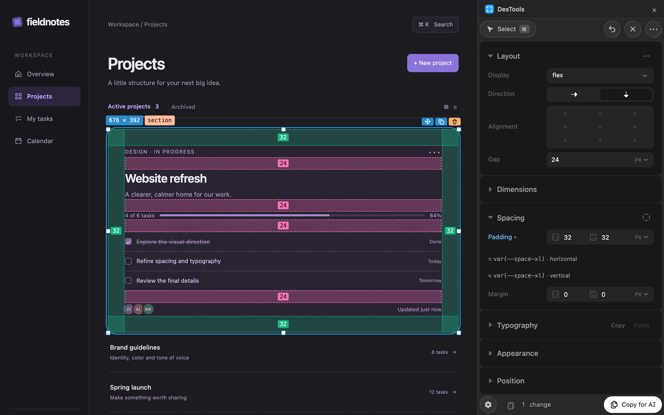
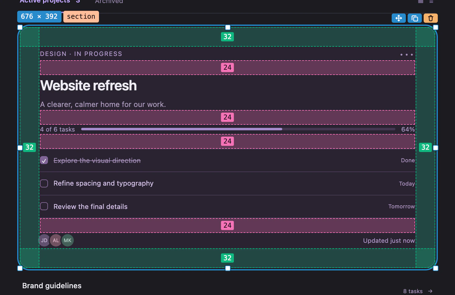
The page itself is the canvas. A selected element gets handles for its size, its padding and the gaps between its children, and every band carries its own number, so spacing can be read without opening the panel. Margin, padding and gap each have a colour of their own, because all three are regularly on screen at once.
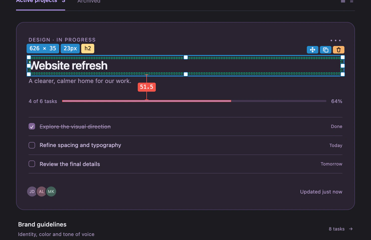
The rest follows what design tools have taught us to expect. Hold ⌥ and hover a second element to measure the distance between the two. Double-click to rewrite text in place, drag an element to a new position, duplicate or remove it. Hold a key at any moment to see the original page and judge the change.
Controls That Draw the Value
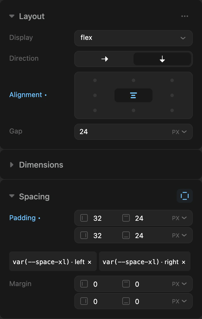
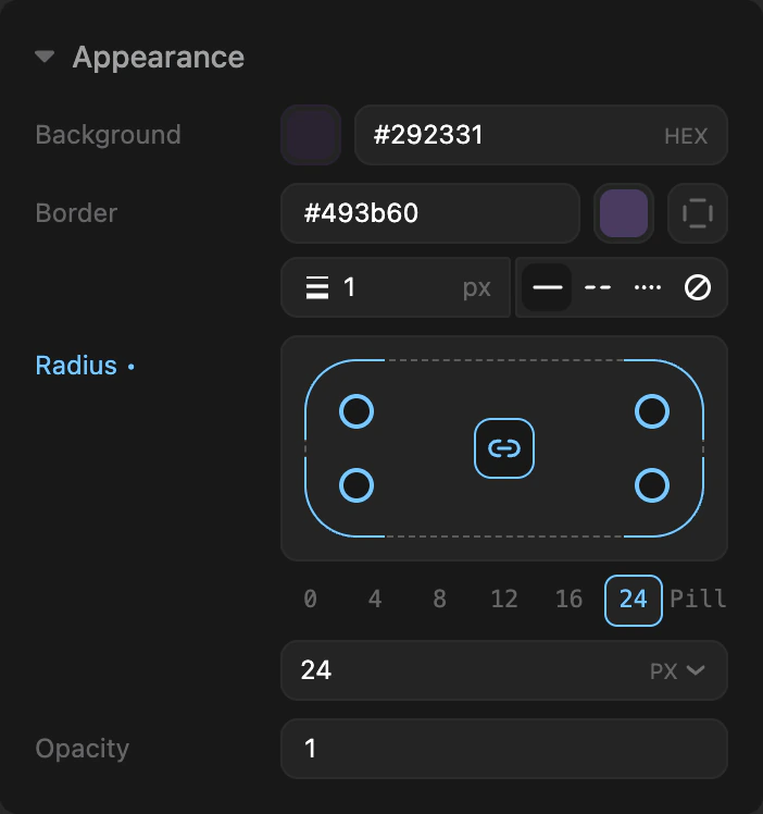
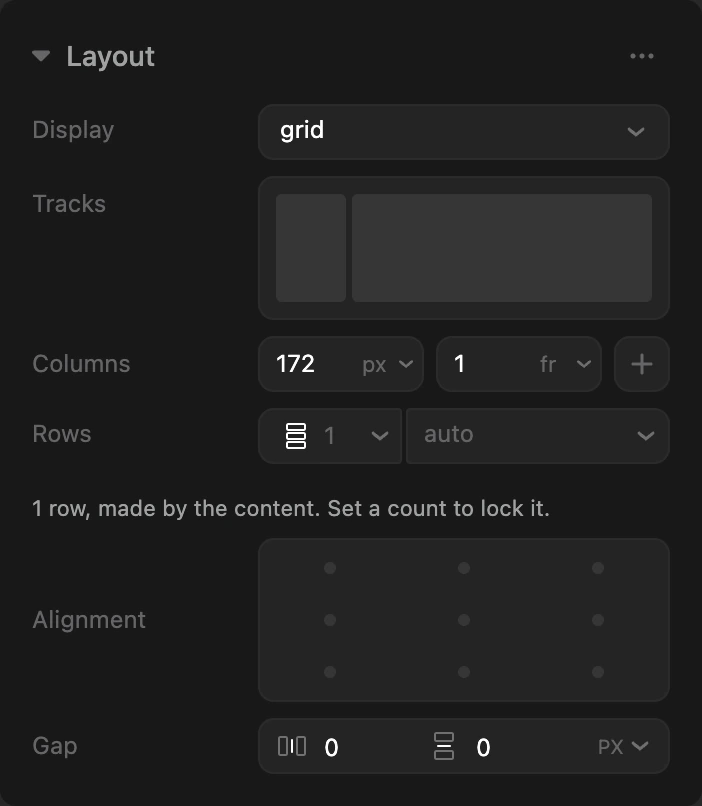
In the panel, wherever a value has a shape, the control shows that shape instead of asking for a number. Alignment is a 3×3 pad. Corner radius is four handles on a miniature of the element. An image’s focal point is a marker on the image itself, and a grid is drawn as its real tracks, with gutters you can drag.
Each control stays honest about its limits: when a value is outside what it can draw, it goes quiet instead of rounding to the nearest option. And when a number matches one of the project’s design tokens, the panel suggests it, so 32px becomes var(--space-xl) with one click.
Finding Your Way Around
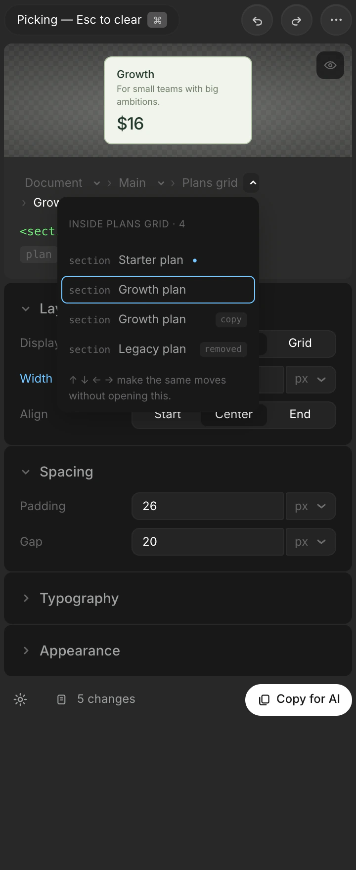
A click cannot always reach the element you mean: a wrapper with no visible edge, one of several identical siblings, something that sits underneath. I explored three ways for the panel to show where the selection sits and let you move from there.
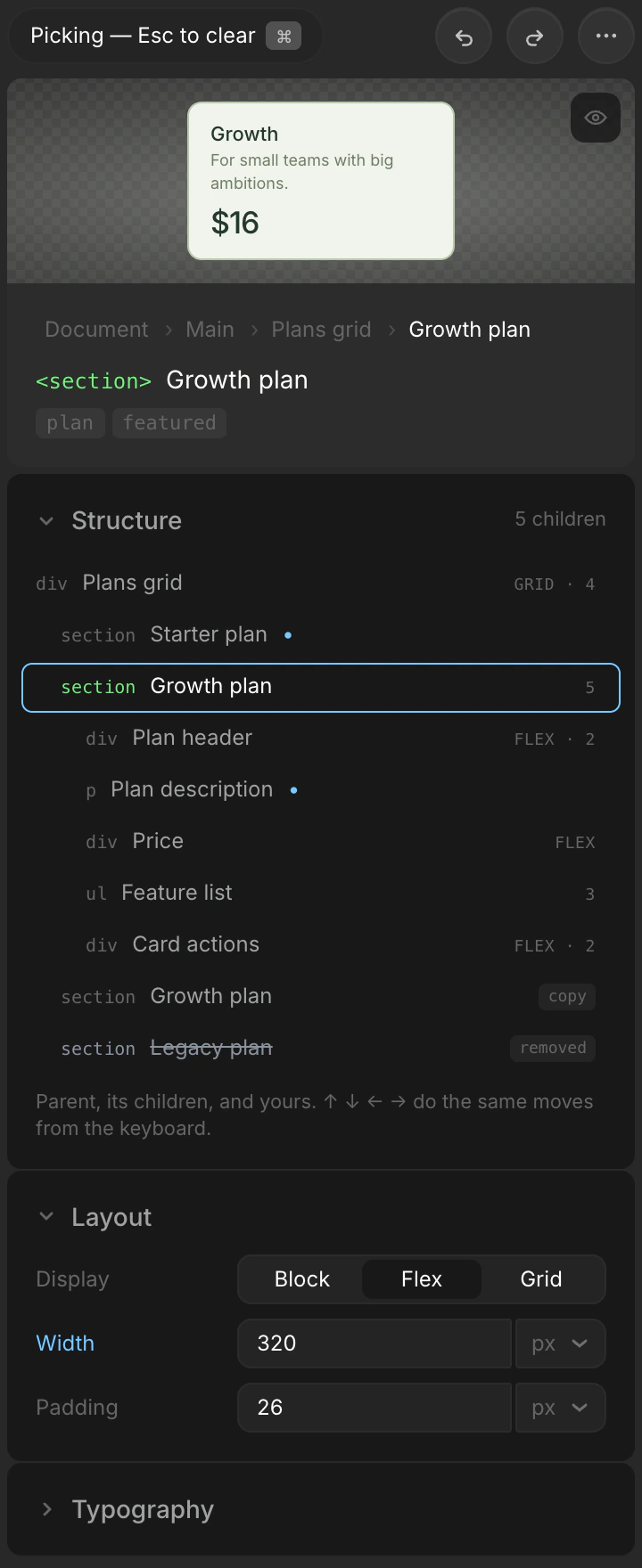
- A. Structure card. Only the parent, the siblings and the children of the selection. Selecting re-roots it, so you walk the page one hop at a time.
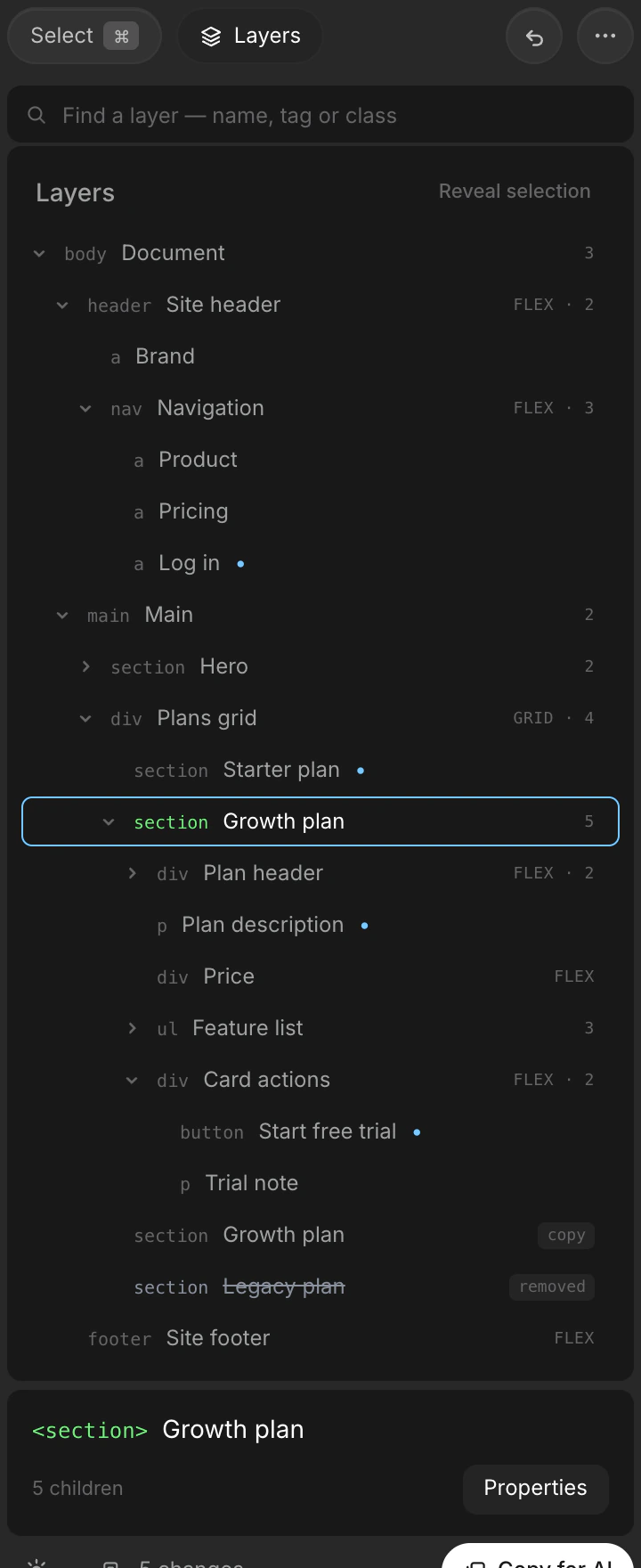
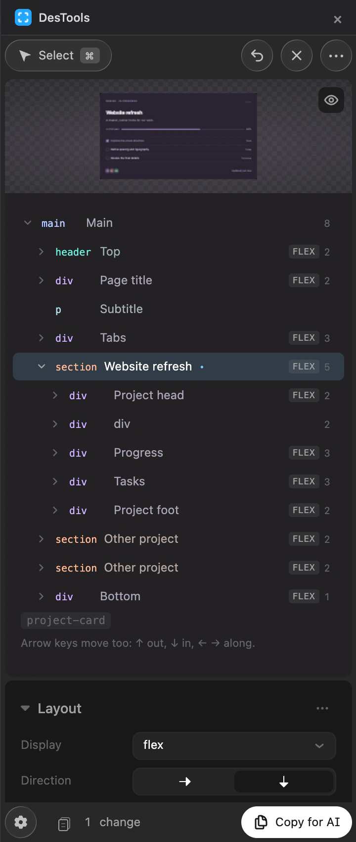
- B. Layers view. A real, searchable tree of the whole page in a view of its own.
- C. Trail menus. No new surface: every crumb in the breadcrumb opens a menu of its children.
I went with the first. A full tree is a second navigation model next to the page itself, it takes the whole panel, and on a real page most of it is wrapper noise. Menus cost no space but hide the structure behind a click. Three levels around the selection turned out to be enough, and the card later replaced the breadcrumb altogether.
The Panel
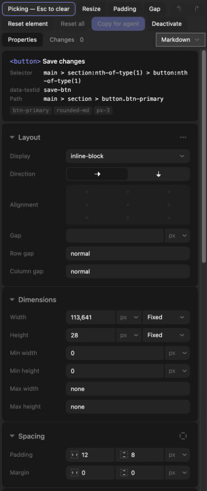
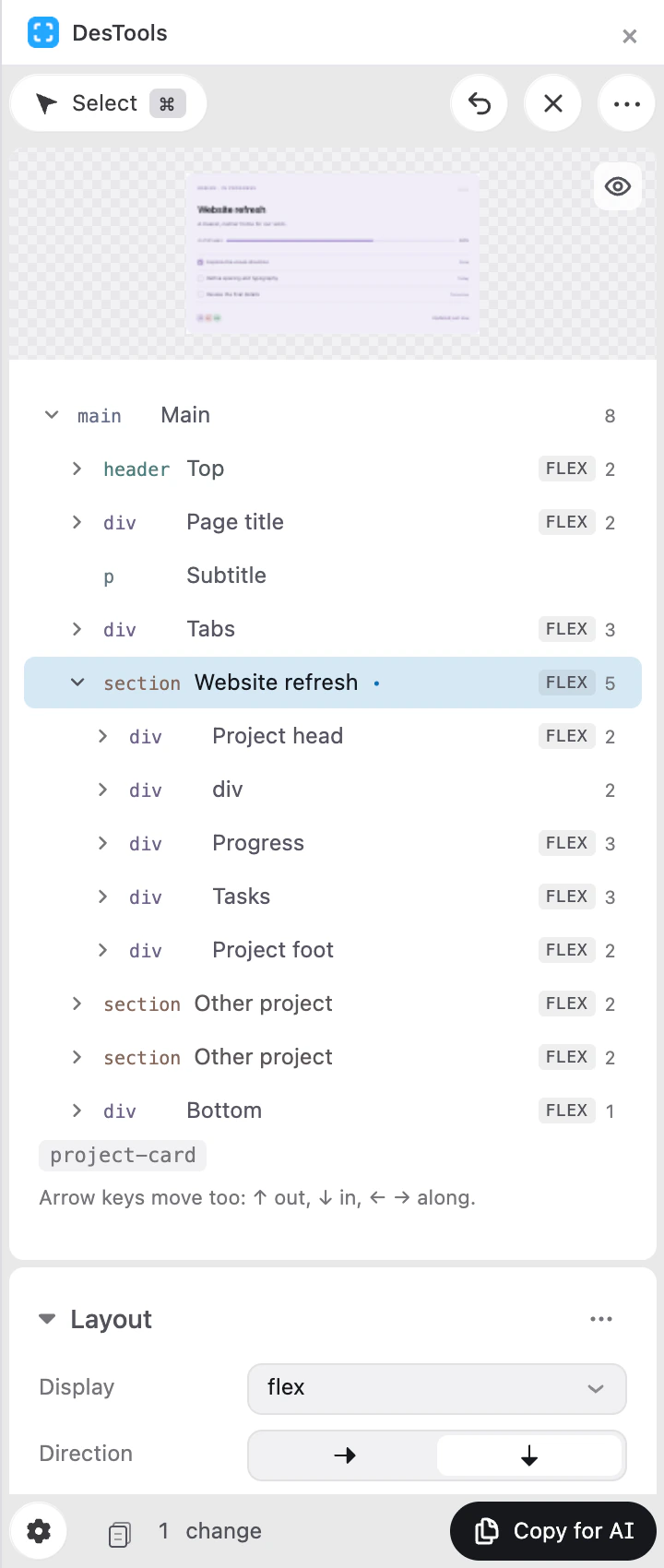
The panel went through two design passes in Figma. The first took it from a working layout to a designed one: surfaces instead of borders, one row for padding with a field per axis, icons where a keyword used to be. The second rebuilt the chrome. The tab row made way for a footer that holds the whole handover: the format, the number of changes and the button that copies them.
Depth comes from four stacked surfaces and nothing else; no line in the panel is visible as a line. Dark is the design, and light is the same structure stacked the other way up rather than inverted. Colour is kept for meaning: blue for what you changed, and a hue per element type that the panel shares with the overlay on the page.
The Handoff
Everything ends in one button. Copy for AI puts a change request on the clipboard, as Markdown or JSON, ready to paste into Claude Code, Cursor, Codex or a chat.
The request is written for an agent rather than for a person. It opens with instructions: match the project’s styling architecture, prefer existing tokens, find the component instead of editing generated output. Every element comes with a selector that was checked to match exactly that element, and every kind of change reads differently: a restyle, a copy change, one more of something, something to delete.
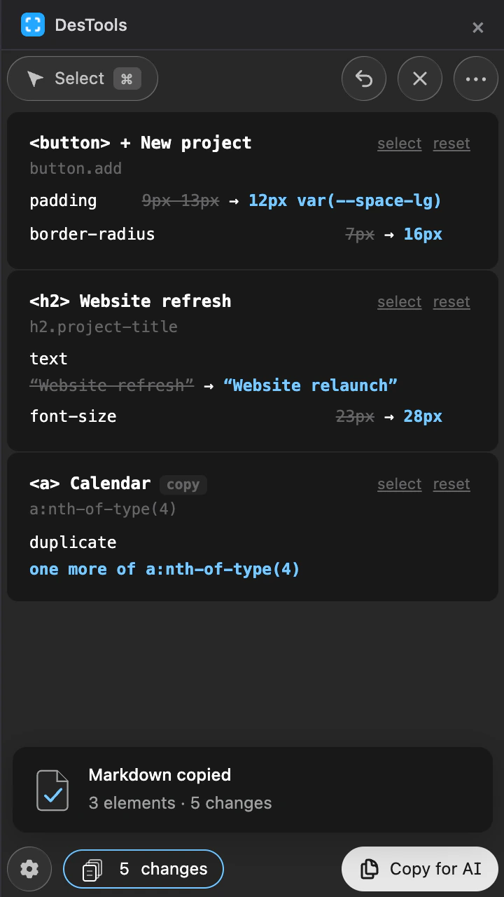
# UI change request (DesTools) Page: http://localhost:3000/demo.htmlViewport: 920 × 6403 elements, 5 changes ## Instructions- Apply these visual changes to the source code.- Match the project's existing styling architecture; do not introduce a new one.- Prefer existing design tokens, utility classes, components, and conventions over new literal values.- Do NOT add inline styles unless the codebase already styles this element that way.- Literal values below are computed browser values — translate them into the units, tokens, and scale the project already uses. Preserve explicit var(...) references: these are chosen project tokens, resolved in the edited element’s scope.- The selector describes where the change belongs in the rendered DOM; find the component that produces it rather than editing generated output.- A "Text" line is a copy change: edit the string at its source (or its translation entry), not the rendered output.- A "Duplicate of" element is a NEW element to add: render one more instance of the named element at the placement given, then apply the changes listed under it. Reuse the component or loop that produces the original rather than duplicating its markup. ## Element 1 — button "+ New project"Selector: `button.add`Classes: addDOM path: div.workspace > main.main > div.page-title > button.add | Property | Current | Requested ||---|---|---|| padding | 9px 13px | 12px var(--space-lg) || border-radius | 7px | 16px | ## Element 2 — h2 "Website refresh"Selector: `h2.project-title`Classes: project-titleDOM path: section#website-refresh > div > h2.project-title Text: "Website refresh" → "Website relaunch" | Property | Current | Requested ||---|---|---|| font-size | 23px | 28px | ## Element 3 — a "Calendar" (copy)Duplicate of: `a:nth-of-type(4)`Placement: immediately after the sourceDOM path: div.workspace > nav.sidebar > div.nav > aIdentity
The icon had to say “selection” at the size of a browser toolbar. I explored fifteen directions, from flat marks to glass, crystal and metal. The four corner brackets of a selection frame were the idea that kept working, and the production icon is its simplest form: flat, blue, and still legible at 16 pixels.
Built in Passes
I built DesTools in 38 passes, writing down every decision: what changed, and why it is shaped the way it is. Not everything survived. Dragging an element first reflowed the page as you hovered, the way auto layout does in Figma. On a real page the layout jumped under the pointer and the target moved while you aimed at it, so a line that stays still replaced it.
Because the tool edits real pages, it is checked in a real browser as well as in unit tests. Cascade order, inline !important and putting a removed element back into the exact slot it came from are things only a browser can confirm.
Conclusion
I took DesTools from an idea to an extension published on the Chrome Web Store: the concept, the interaction model, the visual system and the code that runs it. Most of the design happened after the first version worked, pass after pass, making what already existed more precise and more honest.
Get DesTools on the Chrome Web Store ↗
38
Design and build passes, each one documented
640+
Unit tests
120+
Checks that run in a real browser
0
Host permissions, network requests or accounts