
ExpensePulse™
I led the product design process for a brand new product which is pulling business aviation trip expenses data from different systems and allows to work with them in real time from one place.
Role
Product Designer, UX/UI
Team


Timeline
June 2021 — May 2022
Methods
The Challenges
Idea was to make ExpensePulse a white-labeled B2B SaaS product, so that each company can use their branding guidelines and integrate it into their workflow.
Also, as it is a new product, I need to establish the core principles of its user experience model. I should also improve upon existing products and customize it to meet the needs of operating large amounts of data.
Defining the Problem
First, I did short market research and interview with stakeholders. Some of the problems and findings we identified from the analysis are:
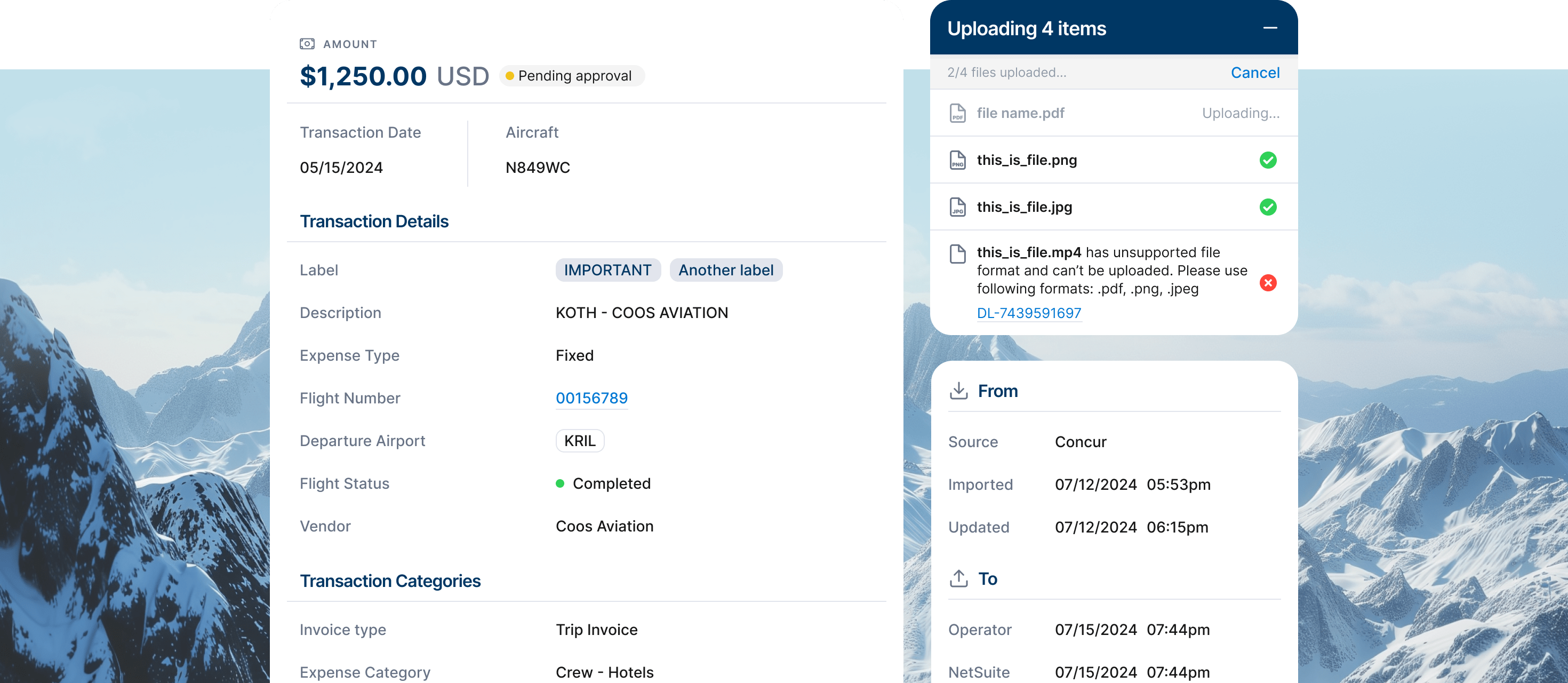
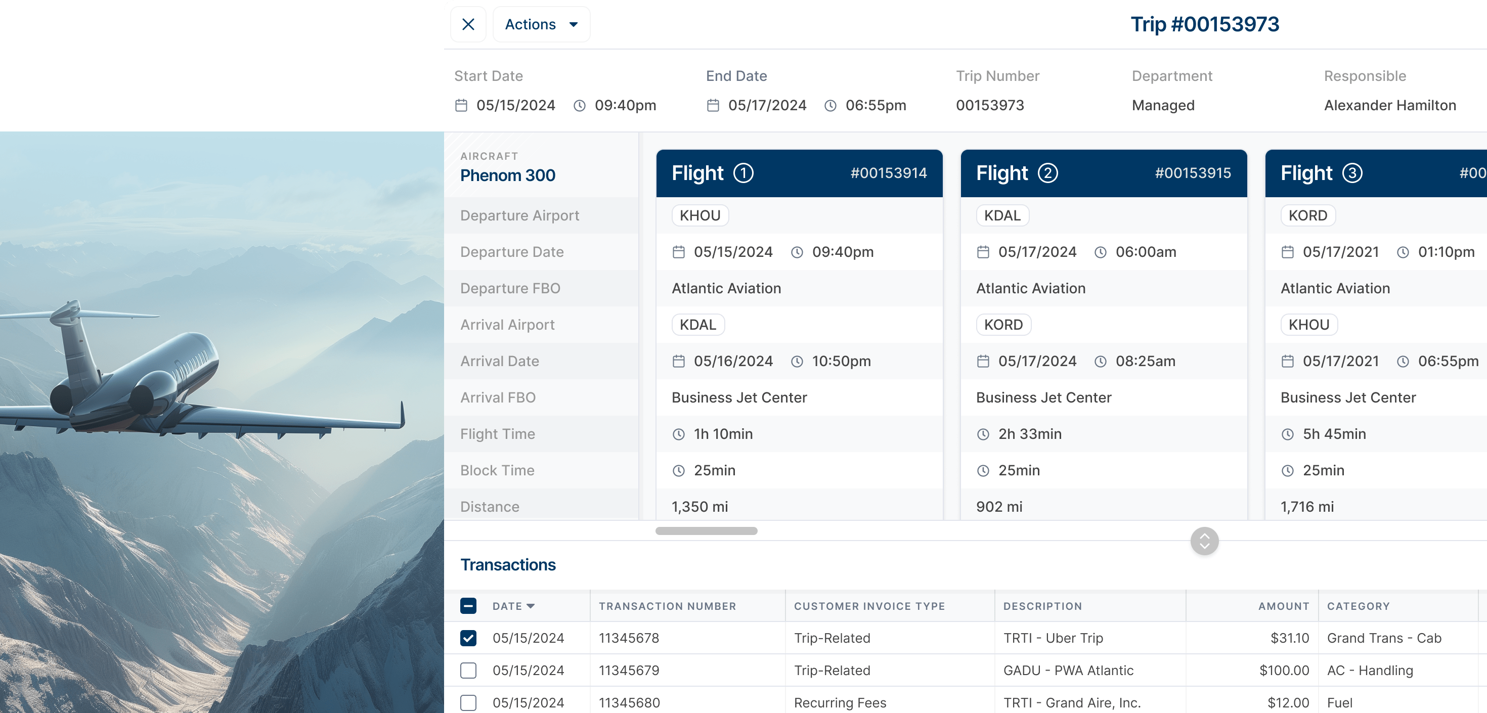
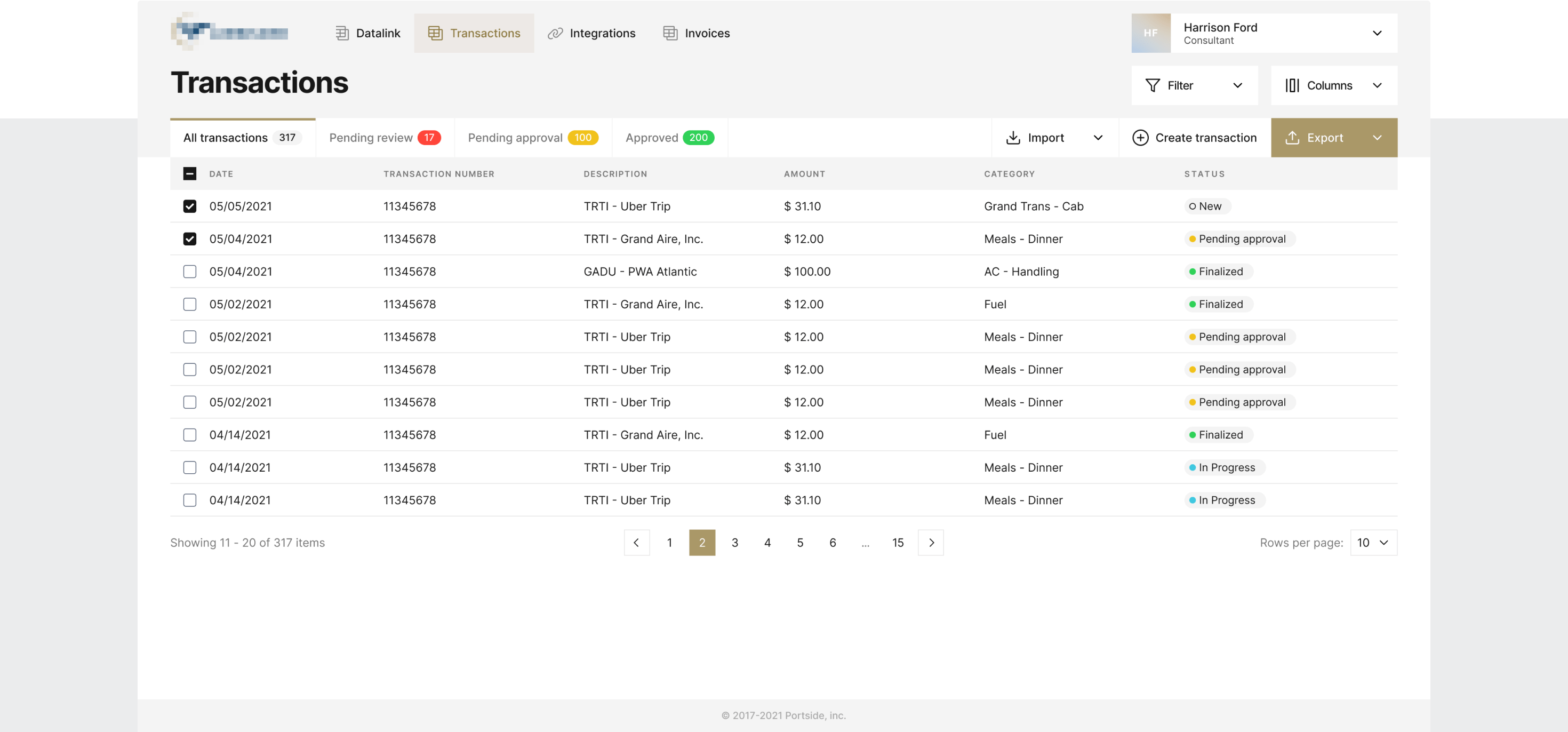
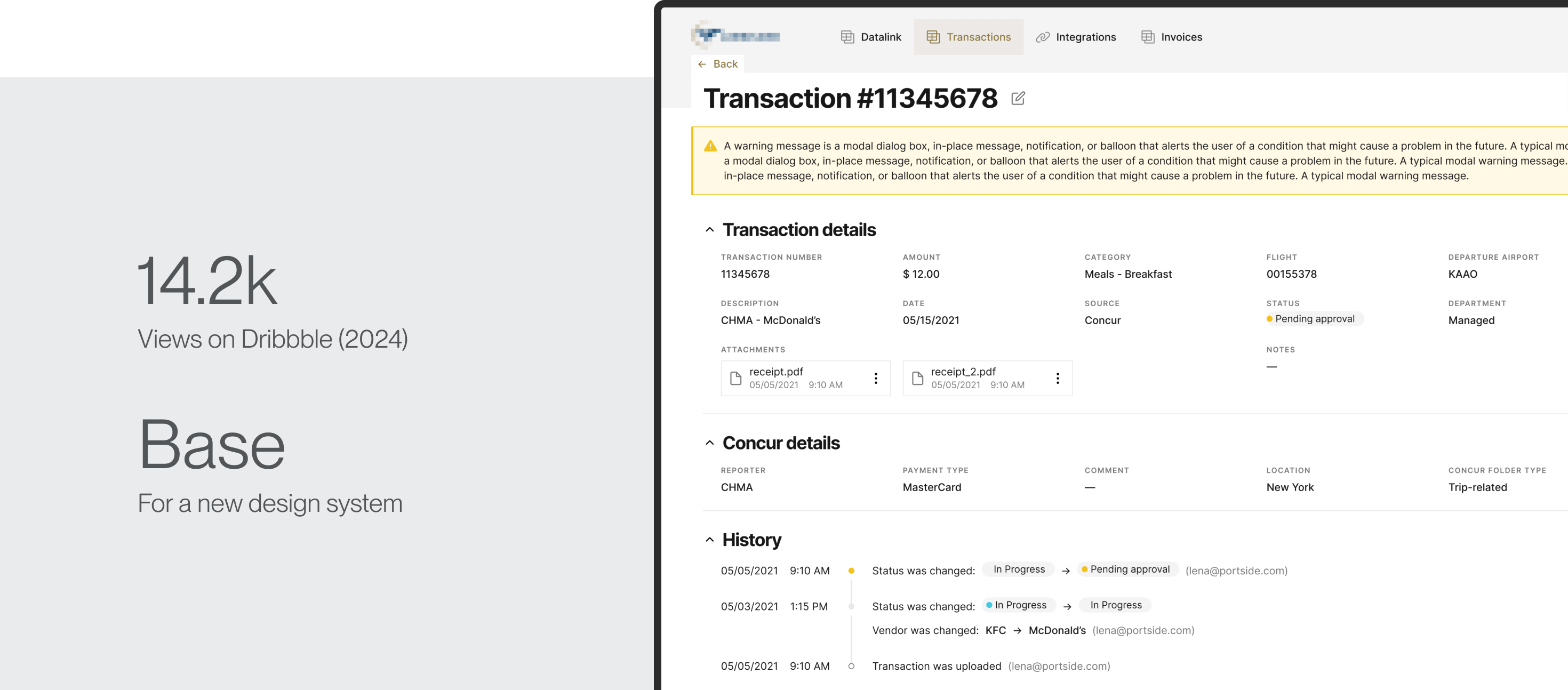
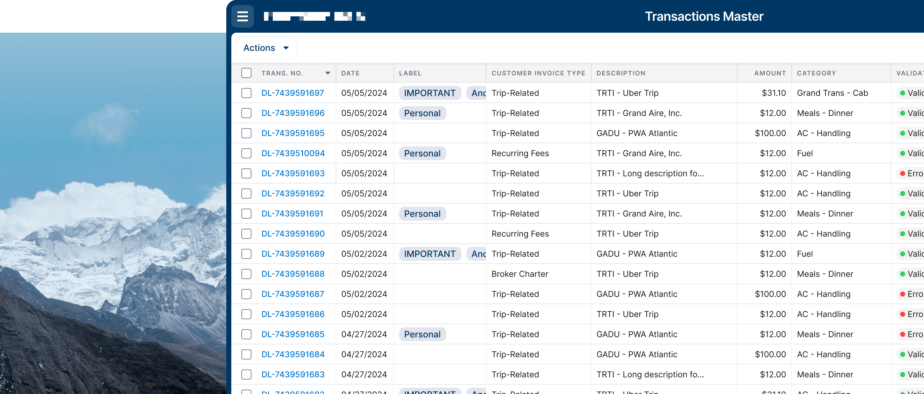
- It’s important to have information of different origin in one view. For example, trip info, legs (flights) in the trip, associated transactions & invoices.
- Core data representation concept will be tables.
- Current design system doesn’t cover this amounts of information effectively. Also visual refresh is required.
- Main users will be technically proficient but workflow should be simple enough to perform tasks quickly.
- Many technical notes was recorded for future use.
Early Ideation
Taking into consideration problems and facts listed above we defined number of ideas which help us to resolve issues and set decent user experience:
- Some of the views will be divided to parts where each part will represent needed info section. Moreover, each space can be resized to fit more information on the screen according to the situation.
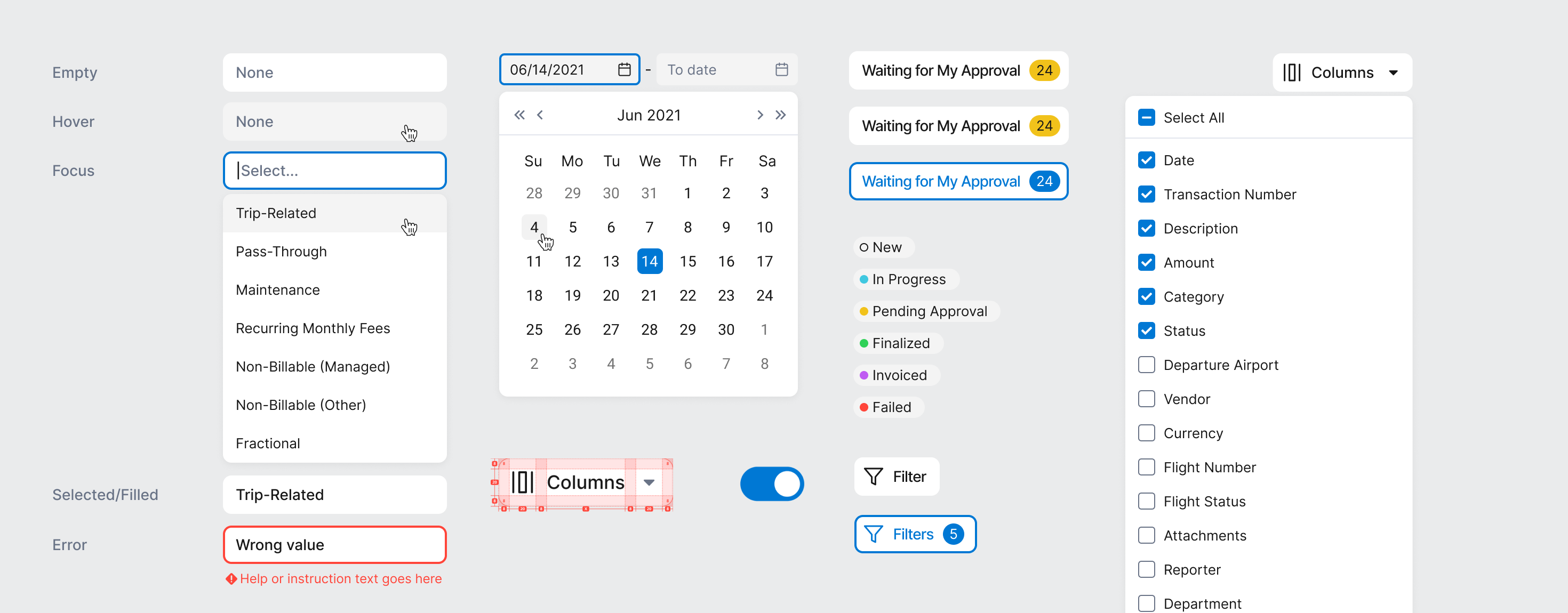
- Table as main work space will take full width of the screen. Rows will be narrower then in current design system. 32px height. Airtable is main inspiration for table design. Row can be highlighted for a better focus on hover. Columns will be resizable. Add inline edit for certain fields.
- Navigation will be on the top to utilise as much horizontal space as possible for all other views.
- To ensure consistency across all clients and expedite onboarding, we limit customization at the early stage to the main brand color, which will be used for all CTAs, links, active states, backgrounds, etc., and the logo.
First Concept
Here is first set of design which I did while working on the product. It was rejected as main stakeholder had different view on UI look & feel. Usually, I don’t start working on design system until first concept is approved, so turnaround was quite easy. Shortly after aligning with main vision points of stakeholder, we continued to work on next iteration which has been successfully approved.
Design System & Design
All existing products of the company have been using Material Design 1.0 design system (2014) which remains functionally well-developed. However, for the new product, there was an opportunity to rejuvenate UI, optimize space utilization and incorporate stakeholder’s vision.
Key points were:
- Minimalism. Large data display obliges us to be careful with color selection and avoid usage of decorative elements which doesn’t serve any purpose.
- Deconstruct already approved page to build foundation for future rich design system.
- Start from the basics. Colours, typography, iconography, layout. Deconstruct already approved page to build foundation for future rich design system.
- Keep round corners and shapes. Personal stakeholder’s preference.
- It should be functional. Layout should adapt to different section sizes which will be dependent not only from screen size but also from users preference.
Interactions
It’s also very important part of design and prototyping. It allows designer to have better control of the user's attention, it can give informative feedback and make product more dynamic and lively.
Conclusion
With well developed design system, agile vertical communication and clear goals we been able to generate following outcomes:
200+
Approved screens for
10
navigation points
On Time
Successful product launch
Effect
Table design was later adopted
in company’s main product
x2
Jump of annual recurrent rate in next quarter after product release